Week 11
Nicole
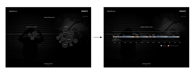
After receiving feedback from the class and Lyn who is our professor of IAT 355 (Data Visualization), I have refined one of our data visualizations from bubble diagram to a timeline. Lyn has given a comment on our bubble diagram, she thought bubble diagram is not the best way to indicate the busy schedule of Maria (our main character) and the representation of the bubble's size is also easily be confused for the users. Therefore, we have changed one of our bubble diagram to a timeline. We think a timeline can express the message of Maria's busy schedule and have minimal time to engage with children.
I have also edited our user testing questionnaire based on the suggestions we received from last week class. From showing both visualizations to the participants, we have decided to present it one by one (50% version A & 50 % version B). We have also created some mini tasks for our participants to see if they are available to get the message from our data visualization. Each task we have timed how fast they can finish seeing which visualization is easier to understand. Since our data visualization user test has been finished, I will be focusing on responsive design next week.
Both
Participant A: Age 51 - 60; Teacher; Often create charts
Participant B: Age 16 - 20; Student; Sometimes create charts
Participant C: Age 51 - 60; Engineer; Sometimes create charts
Participant D: Age 21 - 30; Student; Often create charts


After refining our data visualization user testing questionnaire, we have done 4 user testing with 2 students and 2 middle-class workers. We found out the participants are more toward the timeline charts because it gives more details about Maria. Although the bubble chart is easier to understand, the users could not get the goal of our visualization which is Maria's busy schedule. Two of our participants does not think the bubble chart is easy to understand while the other two participants think the bubble chart is more easy to understand compared to the timeline. However, all of the participants think timeline have a better comprehension of a busy schedule and less time to engage with children.
For the line chart and bar chart testing, all the participants are more likely to see the line chart because it's easy to see the difference between income and the trend of the families income. The line chart is also easier to understand. Some of the participants think the overlapping bar chart is harder to compare and a bit awkward Maria's line stands out.
Kristine
Besides the user testing, this week I am also working on Canada map visualization of the single- parent family rate in each province. I searched for Canada province geomap and converted it to geojson. Then I used geojson in d3 to visualize the shape of Canada. I also inserted the data of single-parent rate, number of single-parent family in each province into our database and use PHP to query them in JSON format. If the rate of the single-parent family in one province is higher, the color will be darker so that the user can see the general data in Canada.

Next week I will add interaction and animation to this map.
After receiving feedback from the class and Lyn who is our professor of IAT 355 (Data Visualization), I have refined one of our data visualizations from bubble diagram to a timeline. Lyn has given a comment on our bubble diagram, she thought bubble diagram is not the best way to indicate the busy schedule of Maria (our main character) and the representation of the bubble's size is also easily be confused for the users. Therefore, we have changed one of our bubble diagram to a timeline. We think a timeline can express the message of Maria's busy schedule and have minimal time to engage with children.

I have also edited our user testing questionnaire based on the suggestions we received from last week class. From showing both visualizations to the participants, we have decided to present it one by one (50% version A & 50 % version B). We have also created some mini tasks for our participants to see if they are available to get the message from our data visualization. Each task we have timed how fast they can finish seeing which visualization is easier to understand. Since our data visualization user test has been finished, I will be focusing on responsive design next week.
Both
Participant A: Age 51 - 60; Teacher; Often create charts
Participant B: Age 16 - 20; Student; Sometimes create charts
Participant C: Age 51 - 60; Engineer; Sometimes create charts
Participant D: Age 21 - 30; Student; Often create charts


After refining our data visualization user testing questionnaire, we have done 4 user testing with 2 students and 2 middle-class workers. We found out the participants are more toward the timeline charts because it gives more details about Maria. Although the bubble chart is easier to understand, the users could not get the goal of our visualization which is Maria's busy schedule. Two of our participants does not think the bubble chart is easy to understand while the other two participants think the bubble chart is more easy to understand compared to the timeline. However, all of the participants think timeline have a better comprehension of a busy schedule and less time to engage with children.
For the line chart and bar chart testing, all the participants are more likely to see the line chart because it's easy to see the difference between income and the trend of the families income. The line chart is also easier to understand. Some of the participants think the overlapping bar chart is harder to compare and a bit awkward Maria's line stands out.
Kristine
Besides the user testing, this week I am also working on Canada map visualization of the single- parent family rate in each province. I searched for Canada province geomap and converted it to geojson. Then I used geojson in d3 to visualize the shape of Canada. I also inserted the data of single-parent rate, number of single-parent family in each province into our database and use PHP to query them in JSON format. If the rate of the single-parent family in one province is higher, the color will be darker so that the user can see the general data in Canada.

Next week I will add interaction and animation to this map.

Comments
Post a Comment